
Role
Sr. Product Designer (2024-2025)
Teams involved
Product・Marketing・Engineering・Management
Platform
Website・E-commerce・Forms・Mobile app
Contribution
Design & Product Strategy・UX/UI Design・Content Design
Project Overview
CARE is on a journey to make preventive medicine accessible to everyone — comprehensive health check-ups, digital access to all data and medical and AI recommendations.
I helped them transition to a digital-first company by applying a design thinking and product discovery mindset to enhance their user experience and lay a solid foundation for their business to scale.
✨ Key contributions:
Rethink the core business offering
Redesign of website and e-commerce platform
Redefine Medical and Lifestyle assessments
Optimize the Mobile App’s UX and defining its future vision
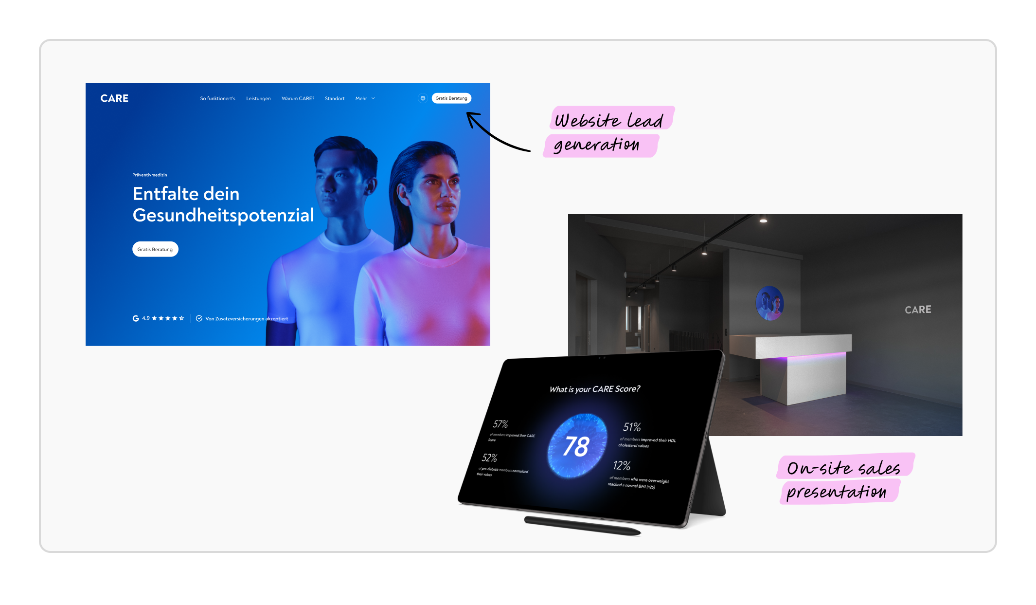
Checkout the CARE Website and app or read the case study below.
Problem context
Rethink the core business offering
Shifting the service offering and operational model to increase revenue and scale.
From “Traditional retail sales” (2023)
Generating leads through free consultations booked online.
Selling Check-up memberships and drips at their Zurich store.
To “Asset light and digital first” (2024)
Shift its operational model to increase revenue, reduce costs and scale.
Digital touchpoints, partner locations, and efficient lead generation and customer acquisition.
Step 1: Research & Discovery
Understanding the problem
To kick-off the project, I gathered insights through customer satisfaction surveys and customer feedback from the store to identify how customers perceive the current offering, services and brand.
Some key questions I aimed to answer:
What data do we have on what did/didn’t work in past CARE offerings?
What do customers value? What are opportunities to improve? What would they like to see?
Who are our current customers? Are there any patterns? What target group shall we aim for?
What do others do well that we can get inspired from?


Step 2: Ideate & Prototype
Co-creating solutions
Workshop 1: New Offering
Based on the research I led an offering workshop with the product team and co-founders to define the problem and ideate on the new offering packages to further test and iterate on.
Key discussion points:
Review insights and target group
Analyse and discuss current offering
Define “How Might We” solve the problem
Ideate new offering models
Prototype and group feedback

Workshop 2: Additional services
CARE also offered additional tests, with high revenue margin but low conversation to buy. I ran a workshop with the medical team to restructure and redefine them.
Key discussion points:
How do the existing additional services offering complements the Check-up?
What additional tests can we offer that make sense both medically and in terms of revenue?
And which target groups would benefit from them?

Step 3: Design & Test
Fine-tuning the solutions to test
From the various ideas, we decided to test a refinement of the current offering tweaking it based on feedback over a 4-week period.
Key deliverables:
Designed different versions of the offering for the website pricing page and sales presentation.
The store team started doing online consultations. They also gathered feedback on how customers perceived these new offerings.
These feedback was iteratively incorporated every third day to get to the best performing offering.

Step 4: Iterating
Pivoting to a new offering
Although the new offering performed better than the old ones — especially with the combination of Check-ups and Add-ons — it was still heavily reliant on human resources, making it too costly for the output it generated.
1. Pricing wasn’t working with the current operational model
Too low for a human-dependent sales model but too high for an online check-out solution.
2. Online consultations weren’t performing as expected
Hard to sell subscriptions, and up-sell add-ons: only 30% show rate and a 25% conversion rate.

Solution
Online Checkout: from traditional sales to a self-service model
The new pricing was the entry point to test a new fully digital sales solution — the online checkout.
From a booking system
Previously, people could only book a free consultation (new customers) or a service appointment (existing customers) and pay on-site.
To an e-commerce platform
Now, people can instantly book and purchase CARE services online via both the website and the CARE app.


✨ Checkout the booking flow online at the CARE website.
The new offering & key results
During 3 months we tested the new offering, and kept adapting it according to the company operational model, customer feedback and profitability until reaching a sustainable model that is scalable to partner locations and aligns with the customer expectations.
Key metrics: marketing spend, highest-paying customers, CPL, and the stability of delivered revenue.
+91% analysis
Increase on number of analysis received, with a stable delivered revenue.
+5 partner locations
Present in 4 cantons, expanding to 2 more in spring 2025.
+65% sales
Increased sales performance since August, reaching record revenue in January.
< CHF 90 CPL
Significantly reducing CPL since early 2024, with more efficient performance marketing spend.


✨ Checkout on the CARE website the new offering and Add-ons.
Problem context
Redesigning the website
A key part of making this transition successful was redesigning the website. Now that the new offering and pricing were working, it was time to update the rest of the site to match the new vision, support business goals, maintain consistency and scalability.
Design audit & Alignment
Workshop: Defining IA & Content Design
To align on what needs to be redesigned and prioritize what and how to build the pages, I runned a information architecture workshop with the co-founders and product team to look into:
Current website IA
New website IA
Define high-level content design for most relevant pages
Prioritize & scope work

Solution
Building the solution step-by-step
Information architecture & Wireframes
Define the sitemap to have an high-level overview of the pages and how they connect.
High-level wireframes with existing and new components.
Content writing and strategy, ensuring clarity and consistency across the site.
Look & Feel and Component Library
Tested different versions both on the web and in ads to see what look & feel performed better. Moved from a dark and futuristic look & feel to a white, more medical oriented one.
To streamline the assembling of new pages in the future, a component library was created in collaboration with Miklos Barton.


✨ Checkout the the CARE website for the full design.
Redefine Medical and Lifestyle assessments
👩🏻💻 Coming soon
Optimize the Mobile App’s UX and defining its future vision
👩🏻💻 Coming soon